
Backdrop Colour choices
-

Pure White
-

Paper White
-
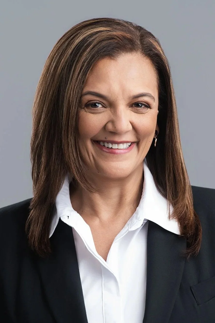
Light Grey
-

Dark grey (most popular)
-

Olive
-

Bone
-

Marine/Navy Blue
-

Black
-

Yellow
-

Apple Green
Backdrop Colour Theory
1. Dark Tones (black, marine blue, dark grey, olive green)
• Energy: Dramatic, moody, serious, powerful.
• Psychology: Commands authority, adds weight and gravitas.
• Perception: If you want to be taken seriously, go dark.
• Use: Corporate leaders, luxury brands, high-end fashion, serious portraits.
2. Light Tones (white, bone, light grey)
• Energy: Soft, light, airy, approachable.
• Psychology: Feels safe, welcoming, calming.
• Perception: If you want to appear fun, jolly, or approachable, go light.
• Use: Lifestyle brands, family portraits, wellness and health industries, approachable professionals.
3. Vibrant Colours (yellow, pink, apple green)
• Energy: Playful, bold, quirky, attention-grabbing.
• Psychology: Adds liveliness, creativity, and youthfulness.
• Perception: If you want to look vibrant, energetic, or unconventional, choose bright tones.
• Use: Startups, creatives, events, marketing campaigns that want to stand out.
4. Neutrals (mid-grey, bone)
• Energy: Balanced, timeless, subtle.
• Psychology: Doesn’t dominate, allows the subject to shine.
• Perception: Professional, adaptable, modern.
• Use: Corporate headshots, editorial portraits, brands that want polish without drama.
👉 Quick Rule of Thumb:
• Dark = Serious, powerful
• Light = Friendly, approachable
• Vibrant = Fun, quirky
• Neutral = Professional, adaptable